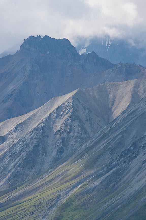
Eastern Sierra Mountains seen from Twin Lakes Road, CA, USA
Every image has three components in it. They are lines, tones and hues.
- Lines – These are edges of forms. Curves are included in this.
- Tones – Brights parts, dark parts and gray parts. The brightness of things.
- Hues – Color.
In a color image, all these three are present. In a black and white, only the first two are present. Therefore, inherently, a black and white image has less information and is simpler.
Consider for a moment – what pleases us in well composed images? There could be many answers to this question, but one thing commonly heard back as an answer to this, is simplicity. People love to look at visually simple compositions. No complications, no distractions. A clear story told simply. Since we just talked about black and white images being simpler, it should follow that for many images, black and white could be more pleasing.
Obviously, for an image of an aspen tree in the fall season, black and white would be the wrong choice. However, for graphical images that don’t rely on its color to tell its story, black and white should be considered. In my opinion, every photographer should at least look at, “How does this image look in black and white?”, as often as possible. It is a great way to look at images graphically, thereby enhancing his/her composition skills.


